In the Category UX
this week in mobile : week 20
Posted May 12th, 2010 at 11:36 am. There are 0 comments.These wireframes screenshots come from a recent developer build of Windows Phone 7. I personally love the way it looks, and would be a really bold move for Microsoft to release such a minimalist black and white UI.
FCC is hoping to get rules passed that require mobile providers to let customers know when they are coming up on their maximum number of minutes or text messages for their plan. If you guess that the mobile companies aren’t too keen on the idea you get a cookie.
Nearly 25% of US adults are without a landline telephone, using their mobile as their primary phone. Are you?
Send a gift via a text message. Go to the site, select a gift, type in the recipients mobile number, pay and send. The recipient receives your text and goes to the store to redeem their flowers, massage, movie tickets etc . Too bad you missed out on this chance on Mothers Day – ya’ know, “When you care enough to send the very best”
Facebook looks to be making it’s much talked about move into the locative “check-in” space currently dominated by Foursquare and other players like Gowalla and MyTown. Some big brands are supposedly on board to bring apps that leverage the check-in functionality (McDonalds is said to be building a coupon or loyalty something or other on the not-yet-announced platform) Given Facebook’s recent troubles with privacy it seems like they may be in for a bumpy ride.
Side by side comparison of HTC Incredible and the Nexus One
Critical take on the changes made in the Sense UI found on the HTC Incredible. Lots of screen shots.
Ouch.
The iAd platform sold by Apple is essentially the opportunity to be associated with Apple. There is nothing new here except the level of control the Apple has over the process. I would add that
The guys behind the app Red Laser talk about how simple UX improvements set their app apart in the marketplace and won them users and acclaim.
Nice look at some of the features in the new iPhone OS but you still got to wait until June? Except you devs already running it 😉
The horse race is heating up in the smartphone market. Android has now surpassed Apple for second position. RIM still in front.
In store digital getting replaced by mobile
There is a trend toward a mobile concierge, a better more personable service than that provided by in store displays.
Mere mortals don’t think of things on their computers as “files.” People think about digital representations of things the same way they think about real physical things: they think about photos, videos, text documents, articles, and people. A “file” on a computer is just a universal container for one of those things.
Square launched to the public.
Download the iPhone or Android app, sign up and get your square reader mailed to you. Whats square? It plugs into the audio jack of your smartphone and lets you accept credit card payments from just about anyone. Need a better explaination? – Watch this fine video
Google and Verizon making a tablet
Also moving away from unlimited data and charging by the bucket of megabytes. ugh.
Mobiles only Internet and the problems there in
Technological gaps exist that make it difficult for mobile only users of the web to have a satisfactory experience. Signup flows and many interactions are still aimed at the desktop web user. nb. Its a short article that links to an academic paper. Nevertheless it underscores the need to design and build for all types of users especially for users that might very likely come to you on a mobile device.
mapping a complete experience
Posted July 7th, 2009 at 11:20 am. There are 0 comments.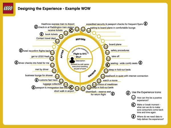
LEGO’s Experience Wheel shows the mapping a complete experience by surfacing the points that are critical to a good experience and where there is opportunity to improve, differentiate or optimize the delivery of the experience, in this case a fictional flight to NYC by a company executive. Bruce Temkin outlines what he like about this particular approach :
- It’s great to have a formal approach to describing/designing experiences
- It starts with the description of a specific customer (in the center)
- It recognizes the life cycle of experiences: before, during, and after
- It’s easy to use and simple to understand
boffin from last.fm
Posted May 15th, 2009 at 8:42 am. There are 0 comments.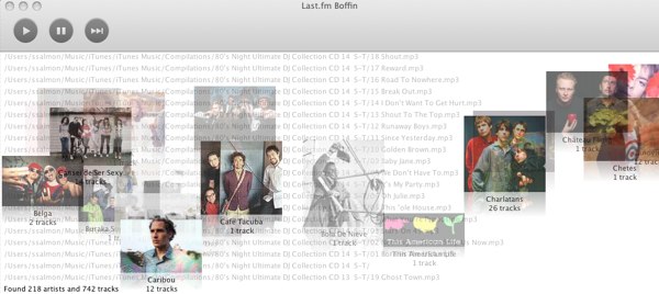
Boffin is last.fm radio for your local music. You aim it at your music collection and it crunches for a bit. While it eats up your music you get a wonderful view of it all, with filename scrolling at warp speed in the background and album covers moving right to left.
This is the nicest possible progress bar an app could have.
When it’s done you get a tag cloud and you can pick the different genres you want to listen to.

just-in-time just-in-place interface
Posted April 15th, 2009 at 11:12 am. There are 0 comments.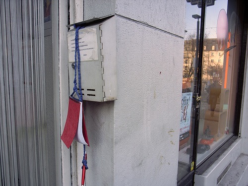
From Pasta & Vinegar, a notepad hanging outside a beauty shop window meant for clients of the salon to leave their name and contact info for the, presumably busy, owner to call them back to make an appointment. Yesterday on my way home I walked by the shop where I sometimes get my hair cut, and knowing I needed a haircut (badly) I turned back around and went in to chat with Carla and make an appointment. This happened because the shop was still open but if she was already closed, I would be putting off getting a haircut even longer. A hanging notebook would provide this just-in-time just-in-place interface for setting up a haircut appointment. I would love to have more ways to interact, however simply or asynchronously, with objects or places that are for all intents and purposes, asleep or otherwise unavailable.
enjoysthin.gs signup is wonderful
Posted January 8th, 2009 at 5:26 pm. There are 0 comments.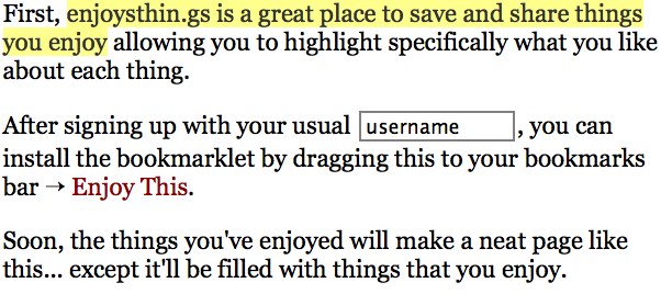
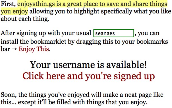
Signing up for a web service like enjoysthin.gs is a pleasure when it is done like this. Like the huffduffer signup, your username is integrated into copy that has a conversational tone rather than stalinistic form to be filled out. Nice touchs include outlining your user name in green to indicate it’s available and the 1-click and you got a full-on user account, just your username is needed. Everything you add on the next page like your name, your email and password if you like are strictly optional, letting you see what you are going to get as quickly and hassle free as possible. Well done.
your phone keypad could have looked like this
Posted December 8th, 2008 at 12:46 pm. There are 0 comments.While 3X3 + 1 wasn’t the most popular in the focus groups, that would be IV-B, it eventually won out. Some of the other designs make sense in as much as they have strong similarity to the dial used on phones previously. I do wonder though, if the prevalent use of the number keypad, in similar forms to the telephone keypad now found on ATMs, safes and my desktop keyboard would look different. Was the 3X3+1 configuration in use in other situations before the telephone company made the switch?
It's a Good Thing
Posted November 13th, 2008 at 1:12 pm. There are 0 comments.Ted Booth, head of Interaction Design at Smart Design spoke earlier this evening at the AIGA Design Remixed series. He spoke a bit about Smart’s approach to running an inter-disciplinary design practice and the role of the ‘hybrid’ in their studio. The ‘hybrid’ spans across disciplines (Smart Design has: Industrial Design, Engineering, Interaction Design, Communication Design, Insight & Strategy and Prototyping) and seems to help drive innovation by having their hands in many pies.I usually consider myself a generalist or hybrid, for better or worse. Of the several projects shown two stuck with me until this morning.
HP Q Control
Conceived out of an initiative to consolidate the many different physical navigation elements across their wide offerings of devices. The Q part is the little back button which dangles off the bottom left which serves as a “get me out of here” safety net for users. It also seems that it creates a crutch for less rigorous interaction design on the screens and functions being controlled by the Q control. Not having ever used one, i can’t really say.
HP produced video talking about the Q Control
HP’s Q Control from maritoruiz on Vimeo.
Augmented Reality Prototypes
In the prototyping of consumer electronics they often mock up user interfaces in Flash and then build rough physical prototypes that control the interactions on screen. While janky, it can be effective but it still doesn’t look pretty. Booth briefly described a methodology they are using on a new project, where physical interactions such as pressing buttons is done on a block of foam covered in green screen paper and the video of the new devices and on screen activity keyed in. I think it would make for a compelling visual and easily help sell their ideas.
No images or video so here’s a clip from the Girl skateboards video Yeah Right where the skaters ride invisible skateboards
Unfinished Swan
Posted October 30th, 2008 at 11:51 am. There are 0 comments.
The Unfinished Swan – Tech Demo 9/2008 from Ian Dallas on Vimeo.
The understated simplicity of this navigation, feeling around in the dark so to speak, is very compelling to me.
Imaginary Friends
Posted October 29th, 2008 at 9:47 am. There are 0 comments.
Creating an imaginary friend allows you to see your friends content within friendfeed even if they don’t use friendfeed. I can’t decide if it is a cheap version of data portability (good) or an additional layer to add to social network fatigue. If widely implemented you may find yourself managing your imaginary friends as you would your real or fake friends.
via atomiq
KOMPAKT-MP3
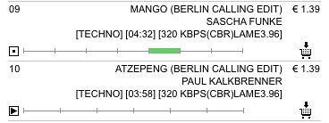
Posted October 24th, 2008 at 8:43 am. There are 0 comments.Kompakt Records has a nice online mp3 store at Kompakt-mp3 and the little preview widget has some really nice behaviors that take the standard 30 second preview a little further and works quite a lot better. The track is divided into sections, seemingly by hand, and you can preview each of them as well as listen to a random section of the track by clicking the play button. The added benfits here allow you to listen to something other than the first 30 seconds, which very often is not representative of the whole track and you can listen to the whole most of the track, in 30 second chunks of course.
[ iamtheweather powered by Wordpress And is definitely Not Plastic Bag ]

