On the Grid
April 30th, 2009 at 7:17 pm. 2 comments.

On the Grid is a project documenting the space created by the vast nationwide network of powerlines and the land underneath them. Undeveloped except for the powerlines them selves they carve through the landscape, connected the most rural with the most urban. The shared space, buzzing with the hum of excess electricity, is at times a pristine and beautiful meadow surrounded by forest and others, the uninhabitable tract amongst suburban banality, beautiful in its own right.
On the Grid, a project by Adam Ryder and Brian Rosa, explores the landscape immediately surrounding high-tension electric transmission lines in Rhode Island. Starting near the Ocean State Power facility in Burnllville, Ryder and Rosa spent several days walking along various sites of this arterial infrastructure. Sites were chosen though surveying publicly available aerial photographs and land use maps, and all photos were geotagged with handheld GPS units. In combining the rigid technical process of digital mapping with the subjective practice of landscape photography, this project explores the state as a collection of differentiated spaces that, though seemingly isolated, are networked.
The resulting photographs showcase the topographical diversity surrounding these structures, whose own narrow terrain remains virtually unchanged throughout their straight, incisive paths. The path of the power lines functions as a rural to urban transect, cutting through farmland and commercial parks, cul-de-sacs and strip malls, used car lots and interstate highways.
As human intervention in the natural landscape sprawls to the most remote areas of the state, our lived space becomes increasingly regulated and our encounters with equivocal territories are especially rare. In more urbanized areas, we lose our relation to places which seem to exist unto themselves, where one can feel alone and unhindered. The ambiguity of the land occupied by high-tension power offers the possibility of experience outside of regulation. Despite being part of an infrastructure that is highly regulated and bureaucratized, the physical space inhabited by these power lines remains easily accessible though its sheer ubiquity. Thus, paradoxically, the realm of power lines seems to exist not only outside of regulation, but also outside of the normative properties of the native landscape. Whereas an area half of a mile away from a high tension line may be densely wooded, the space occupied by the wires will be clear-cut, devoid of trees and exhibiting, at most, low shrubbery and grass. The uniformity of this narrow swath as it cuts through the landscape reveals as much about its own spatial utility as it does of the landscape it bifurcates across the state (and beyond). It is this topographical sameness that makes the power lines amazing sites of contrast against both development and the natural landscape.
On the Grid invites reflection on the blurred relationship between networked technology, the built environment and nature through these buzzing monoliths.
– Website Text (An image on the original website)
They did a nice interview on the NPR show Living on Earth (mp3 link).
Quoting here,
Yeah absolutely, it’s a really unique tract of land that doesn’t have any development on it except for itself. So, it’s kind of, in a way its really pristine and untouched and…virginal, its kind of, kind of like, romantic and magical in that way.
-Adam Ryder
and
What’s really – I think actually awesome, is the best word I can use to say it – what’s really awesome about seeing this parade of power lines through the landscape, especially in rural areas is that we’re kind of seeing these, these tendrils connecting humanity as one large organism and it’s a cool way of looking at us, you know what I mean?
-Adam Ryder
Locate powerline grid infrastructure near you via this previous post
sky, free of charge
April 30th, 2009 at 3:15 pm. 0 comments.
Sand Ocean Sky Available 7 Days Free of Charge – Steve Lambert
dead pixel for google earth
April 30th, 2009 at 11:50 am. 0 comments.82 x 82 cm burned square, the size of one pixel from an altitude of 1 km.
A real life dead pixel by Helmut Smits. Digital display technologies affecting the real physical world with it’s intentions of affecting the digital representation of the physical world. See also.
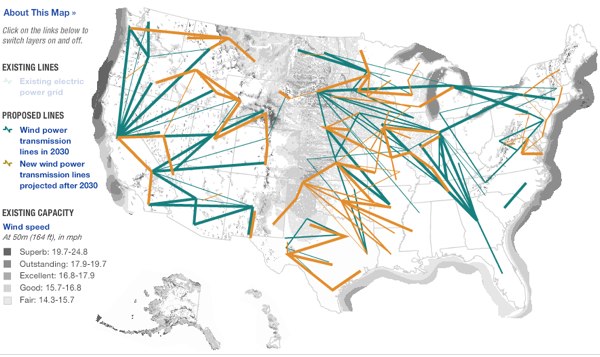
NPR maps the Energy Grid
April 29th, 2009 at 2:29 pm. 0 comments.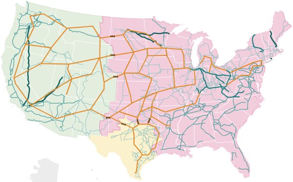
NPR has some very nice visualizations of the United States electrical grid, including views for solar power and wind sources, including the the below which shows the realationship between where the good wind is, darker colors, and where the power grid is, not usually all that nearby.
kevin slavin interview
April 17th, 2009 at 6:58 pm. 0 comments.Nice short interview with Kevin Slavin of Area/Code at Fabrica Blog from last year. Two striking quotes, but go read the whole thing
Regarding an very small anti-war protest in 2003, emphasis mine. –
And I realized that they had earpieces, and were connected to spotters, who were also in the city. And I saw that, and thought that it was unlike anything that we had ever seen before. The technologies of communication that are usually associated with authority start to be used in a million other ways. I saw that their ability to communicate was going to enable totally different ideas of how we actually use space. By 2003, the mobile phone was already common, but the ideas of groups and more sophisticated interactions other than ‘I’m calling you’ hadn’t really been popularized.
But a big question mark had appeared over Broadway for that moment.
Regarding PacManhattan, again emphasis mine –
The things that have happened over the last ten years point to the need to restore the idea of thinking of the city as a system upon which things can be run. That the streets are not purely for commerce or transportation, but that they have a number of layers. To think of the city as hardware that different software can be run on. Some of that software is an entertainment software, one of the titles could be Pacman. To think of the city like that seemed like a new idea, and at the same time, a very old one. It’s also one that can be rethought with new technologies. Mobile technologies allow us to do it in ways that we may have never been able to do.
Alissia Melka-Teichroew interview
April 17th, 2009 at 4:41 pm. 0 comments.
I would like to direct your attention to an interview of industrial designer Alissia Melka-Teichroew by Michael Surtees over at designnotes. Really quite good. Alissia is the designer of the ring I gave to Doris when I asked her to marry me nearly two years ago.
My diamond rings… There wasn’t a “problem” with the existing ones. I just question the fact if people really still remember the original value (not the diamond, but the act of asking someone to marry you) that is not a problem I think, that I solved. It’s just one of many ways to look at it.
byamt website
@alissiamt on twitter
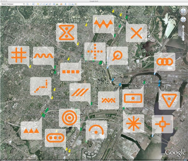
gateways to newark by pentagram architects
April 17th, 2009 at 10:52 am. 0 comments.
Newark Gateways by Pentagram Architects to create a series of gateways to the city of Newark New Jersey. Painting a series of cartographic type symbols into the Newark streetsccape, in actual physical space, with the intention that they will eventually be incorporated into google earth & google maps satellite views. There are two very interesting ideas at play here – deliberate alteration of the physical environment to affect the display of its digital representation, and the cartographication of the physical space, placing the visual language of representation into the actual.
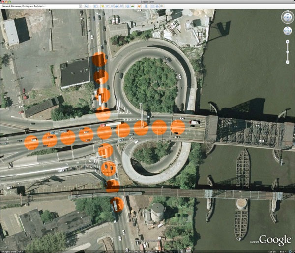
Map symbology has a long and storied history. The process of representing the three-dimensional world as flat and map-like requires a notational language. Our proposal places a new set of distinct symbols “on the map” by creating them for the Google Earth point of view. With paint and little else, Newark can define itself, celebrate its entry points, and address a global audience, all in one stroke. The painted “events” are visible and engaging on Google Earth, while the real locations would be signed with images from above that explain the colors and patterns on the ground.
tokyo jogging
April 15th, 2009 at 12:18 pm. 0 comments.
Try to run on the google street view like a jogging game of wii fit from katsuma on Vimeo.
tokyo jogging is a mashup of wiimote and google streetview. Lets you “run” in Tokyo, in your web browser.
The possibilities of this are pretty interesting. Combined with the tv screen on the treadmill or exercise bike at the gym you could run world famous marathon routes and in places where running isn’t usually feasible, say, run the length of the New York Thruway.
via @oliver76
just-in-time just-in-place interface
April 15th, 2009 at 11:12 am. 0 comments.
From Pasta & Vinegar, a notepad hanging outside a beauty shop window meant for clients of the salon to leave their name and contact info for the, presumably busy, owner to call them back to make an appointment. Yesterday on my way home I walked by the shop where I sometimes get my hair cut, and knowing I needed a haircut (badly) I turned back around and went in to chat with Carla and make an appointment. This happened because the shop was still open but if she was already closed, I would be putting off getting a haircut even longer. A hanging notebook would provide this just-in-time just-in-place interface for setting up a haircut appointment. I would love to have more ways to interact, however simply or asynchronously, with objects or places that are for all intents and purposes, asleep or otherwise unavailable.
horizon graphs
April 14th, 2009 at 11:30 pm. 0 comments.
Horizon graphs allow large amounts of information to be shown in a cramped space with out a loss of resolution. In the examples the time series in the x-axis is maintained while the y-axis information the height, is able to be displayed in a fraction of the height. By segmenting and overlaying the information vertically, and color coding the values where the denser the color the higher the value, comparative analysis of large amounts of data is easy.
Time on the Horizon article from Visual Business Intelligence Newsletter
[ iamtheweather powered by Wordpress And is definitely Not Plastic Bag ]