In the Category simplicity
scratched into the surface
Posted June 1st, 2011 at 10:53 am. There are 0 comments.

The wall as palimpsest, scraped away to reveal faces of the past hidden in the layers. wonderful work by the artist Alexandre Farto
mit media lab gets a new identity
Posted March 7th, 2011 at 10:07 pm. There are 0 comments.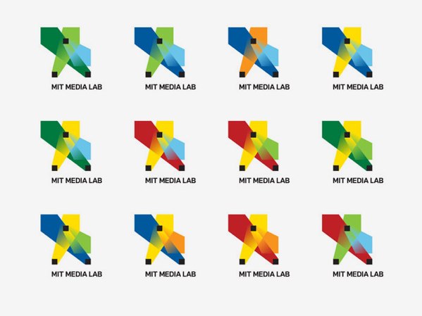
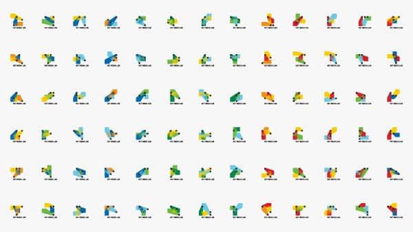
The logo is based on a visual system, an algorithm that produces a unique logo for each person, for faculty, staff and students. Each person can claim and own an individual shape and can use it on their business card a personal website. The design encompasses all collateral, business cards, letterhead, website, animations, signage etc. A custom web interface was developed to allow each person at the Media Lab to choose and claim an own individual logo for his/her business card, as well as a custom animation software which allows to create custom animations for any video content the lab produces.
See the system in action in a little video
Designed by E Roon Kang in collaboration with TheGreenEyl
architects
Posted March 4th, 2011 at 8:49 pm. There are 0 comments.
The All Nighter has simplified famous architects quite a bit. I love this.
graffyard is visual embed tags for the city
Posted May 18th, 2010 at 11:57 am. There are 0 comments.

graffyard makes past graffiti made visible after it has been cleaned up.
It’s a nice example of encoding the visual history of the city onto itself. One can imagine a future where city walls have a secondary digital presence and all advertising, graffiti and signage takes place via a persistent visual augmented reality system. The city becomes a contiguous blank canvas, a physical platform encoded with embed tags for the reality we want to see. Maybe.
this week in mobile : week 20
Posted May 12th, 2010 at 11:36 am. There are 0 comments.These wireframes screenshots come from a recent developer build of Windows Phone 7. I personally love the way it looks, and would be a really bold move for Microsoft to release such a minimalist black and white UI.
FCC is hoping to get rules passed that require mobile providers to let customers know when they are coming up on their maximum number of minutes or text messages for their plan. If you guess that the mobile companies aren’t too keen on the idea you get a cookie.
Nearly 25% of US adults are without a landline telephone, using their mobile as their primary phone. Are you?
Send a gift via a text message. Go to the site, select a gift, type in the recipients mobile number, pay and send. The recipient receives your text and goes to the store to redeem their flowers, massage, movie tickets etc . Too bad you missed out on this chance on Mothers Day – ya’ know, “When you care enough to send the very best”
Facebook looks to be making it’s much talked about move into the locative “check-in” space currently dominated by Foursquare and other players like Gowalla and MyTown. Some big brands are supposedly on board to bring apps that leverage the check-in functionality (McDonalds is said to be building a coupon or loyalty something or other on the not-yet-announced platform) Given Facebook’s recent troubles with privacy it seems like they may be in for a bumpy ride.
Side by side comparison of HTC Incredible and the Nexus One
Critical take on the changes made in the Sense UI found on the HTC Incredible. Lots of screen shots.
Ouch.
The iAd platform sold by Apple is essentially the opportunity to be associated with Apple. There is nothing new here except the level of control the Apple has over the process. I would add that
The guys behind the app Red Laser talk about how simple UX improvements set their app apart in the marketplace and won them users and acclaim.
Nice look at some of the features in the new iPhone OS but you still got to wait until June? Except you devs already running it 😉
The horse race is heating up in the smartphone market. Android has now surpassed Apple for second position. RIM still in front.
In store digital getting replaced by mobile
There is a trend toward a mobile concierge, a better more personable service than that provided by in store displays.
Mere mortals don’t think of things on their computers as “files.” People think about digital representations of things the same way they think about real physical things: they think about photos, videos, text documents, articles, and people. A “file” on a computer is just a universal container for one of those things.
Square launched to the public.
Download the iPhone or Android app, sign up and get your square reader mailed to you. Whats square? It plugs into the audio jack of your smartphone and lets you accept credit card payments from just about anyone. Need a better explaination? – Watch this fine video
Google and Verizon making a tablet
Also moving away from unlimited data and charging by the bucket of megabytes. ugh.
Mobiles only Internet and the problems there in
Technological gaps exist that make it difficult for mobile only users of the web to have a satisfactory experience. Signup flows and many interactions are still aimed at the desktop web user. nb. Its a short article that links to an academic paper. Nevertheless it underscores the need to design and build for all types of users especially for users that might very likely come to you on a mobile device.
flying 101
Posted February 22nd, 2010 at 7:15 pm. There are 0 comments.
Kulula airlines from South Africa has rebranded with some nice information rich livery.
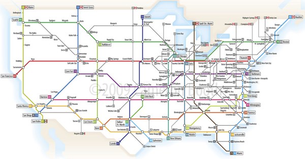
US Interstate system as a tube map
Posted November 12th, 2009 at 12:25 pm. There are 0 comments.Senex Prime on flickr
the sea level rises and Switzerland becomes a series of islands
Posted October 22nd, 2009 at 12:42 pm. There are 0 comments.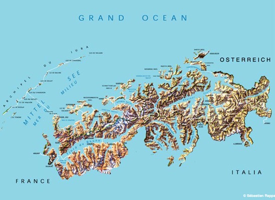
I don’t remember seeing this in particular at the Swiss EXPO.02 but a number of artists working together under the name Waterproof “imagined a(n) (im)possible scenario wherein the water level in Switzerland rises to 1400 meters (4600 feet), turning the landlocked, Alpine country into an island nation, its rocky peaks rising above a vast ocean.”
The series of images over at Pruned show an imaginative take on how the Swiss might deal with their new situation.
via Pruned
CLOUD
Posted October 1st, 2009 at 8:01 pm. There are 0 comments.
Ron English takes graffiti to new heights this morning by skywriting the word CLOUD five times across lower Manhattan. The text soon dissipates into… actual clouds.
As quoted from his website.
i do like these images
Posted August 4th, 2009 at 6:15 pm. There are 0 comments.i like these from here. I really really like. ♥
(via ffffound)
[ iamtheweather powered by Wordpress And is definitely Not Plastic Bag ]
