Tagged with maps
chemical signatures in our drinks
Posted July 1st, 2010 at 10:00 am. There are 0 comments.
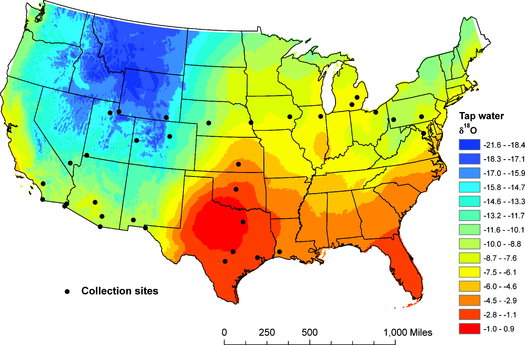
Trackable Beverages This tap water “isoscape” map shows how hydrogen and oxygen isotopes vary throughout the country. Geographic factors like latitude, altitude and proximity to coasts all play a role in this isotopic variation. The cities on the map show where the researchers tested tap water along with bottled water, soda and beer. ACS/Journal of Agricultural and Food Chemistry
These geographically specific signatures show up in human hair making a record of you travels a real possibility.
To test this theory, the scientists analyzed tap water from 33 cities and looked at isotope patterns in Dasani bottled water, Coca-Cola Classic and Budweiser. They found the beverage isotope pattern from those cities matched the tap water pattern — which makes sense, because many beverage companies produce their drinks regionally instead of in one main location. For example, if you drink a Bud in Utah, it probably came from the Anheuser-Busch plant in Fort Collins, Colo., not St. Louis.
via fresser
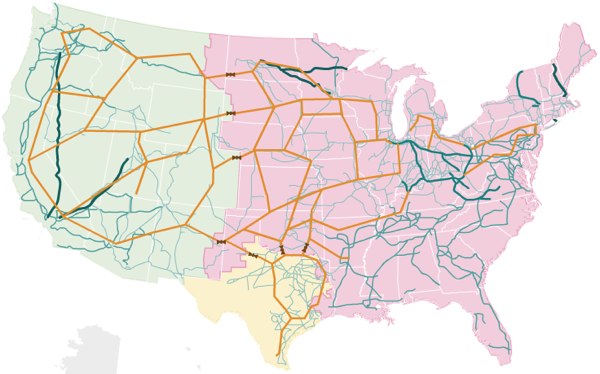
US Interstate system as a tube map
Posted November 12th, 2009 at 12:25 pm. There are 0 comments.Senex Prime on flickr
The Hand Drawn Map Association
Posted June 26th, 2009 at 1:47 pm. There are 0 comments.
The Hand Drawn Map Association is an ongoing archive of user submitted maps and other interesting diagrams created by hand. There are 150 maps submitted already including some lovely map collections.
Our current collection features a set of maps created by John Hutchison exploring his relationship to the 50 states in the US. The collection starts with a map representing all of the US states. Each successive map in the collection reveals a different set of states based on increasingly limiting criteria until we are left with only 1 state (his least favorite).

Image Credit: John Hutchinson April 29th – “US state I have Visited”
subway sparklines
Posted May 9th, 2009 at 4:18 pm. There are 0 comments.
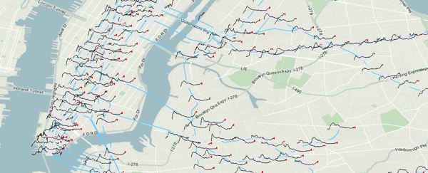
Mike Frumin’s map that show New York City subway ridership between 1905 to 2006 with sparklines for each station. Its great to see sparklines in use on a map, where the detail given by the sparkline is a kind of cartographic detail you can get lost in when looking at a map.
The general idea it that the history of subway ridership tells a story about the history of a neighborhood that is much richer than the overall trend.
NPR maps the Energy Grid
Posted April 29th, 2009 at 2:29 pm. There are 0 comments.
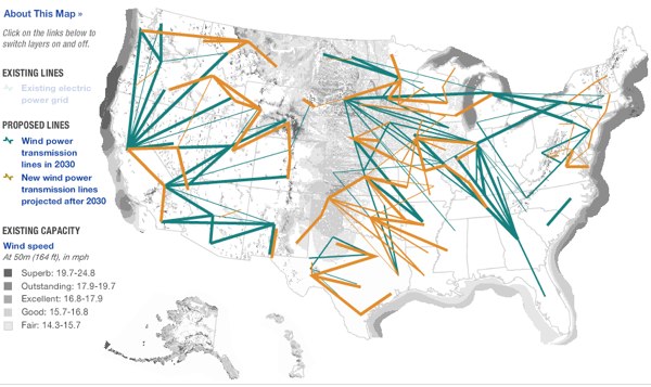
NPR has some very nice visualizations of the United States electrical grid, including views for solar power and wind sources, including the the below which shows the realationship between where the good wind is, darker colors, and where the power grid is, not usually all that nearby.

2008 edits at OpenStreetMap.org
Posted January 7th, 2009 at 5:42 pm. There are 0 comments.
OSM 2008: A Year of Edits from ItoWorld on Vimeo.
Very nice animation showing the activity on the maps at OpenStreetMap.org
If you look closely you can see the edits I made in Jersey City last year.
street view coverage maps
Posted December 9th, 2008 at 6:07 pm. There are 0 comments.Google updated Street View in the US today and have expanded the coverage quite a bit. What used to be a series of small puffy blue clouds covering mostly metropolitan areas has now become are sea of blue covering much of the nation.

After

Before
follow the red line navigation
Posted December 19th, 2007 at 9:38 am. There are 0 comments.
Virtual Cable technology that draws route information in an augmented reality display. The 3 dimensional display is created with lasers and mirrors (didn’t fully read that section) and is generated from standard route information output by numerous GPS and SatNav systems available today. The remarkable part about it is the simplicity of the system. “Follow the red line around until we tell you to stop.” The danger may be, as we have seen before, that the information is followed blindly, although keeping ones eyes on the road, and slightly above it, may be better for safety than trying to focus on small map screens, or to decipher the robo-voice directions to bear left in point-five-two miles.
[ iamtheweather powered by Wordpress And is definitely Not Plastic Bag ]
