NPR maps the Energy Grid
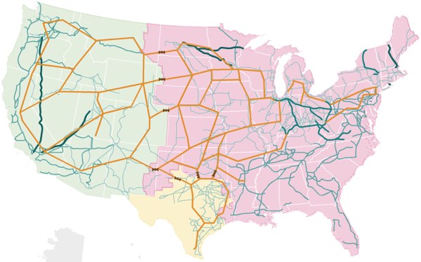
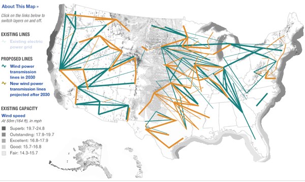
NPR has some very nice visualizations of the United States electrical grid, including views for solar power and wind sources, including the the below which shows the realationship between where the good wind is, darker colors, and where the power grid is, not usually all that nearby.
«previously kevin slavin interview
No Responses to “NPR maps the Energy Grid” | Skip to comment form
Written by admin (contact).
It was written on April 29th, 2009 at 2:29 pm
Filed in the Category information, interesting, map
April 30th, 2009 at 7:17 pm
[…] Locate powerline grid infrastructure near you via this previous post […]
May 1st, 2009 at 8:14 am
[…] “NPR maps the Energy Grid” I find these kind of maps fascinating on a couple different levels. There’s the proximity of lines to actual cities (or distance from them), and the patterns the lines make that outline energy. […]