Tagged with graph
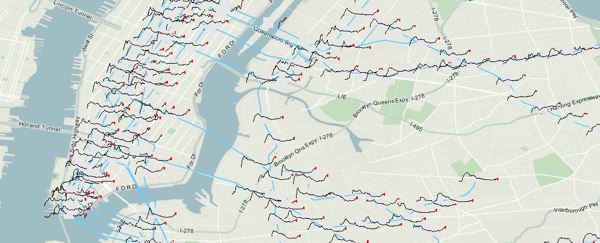
subway sparklines
Posted May 9th, 2009 at 4:18 pm. There are 0 comments.
Mike Frumin’s map that show New York City subway ridership between 1905 to 2006 with sparklines for each station. Its great to see sparklines in use on a map, where the detail given by the sparkline is a kind of cartographic detail you can get lost in when looking at a map.
The general idea it that the history of subway ridership tells a story about the history of a neighborhood that is much richer than the overall trend.
horizon graphs
Posted April 14th, 2009 at 11:30 pm. There are 0 comments.Horizon graphs allow large amounts of information to be shown in a cramped space with out a loss of resolution. In the examples the time series in the x-axis is maintained while the y-axis information the height, is able to be displayed in a fraction of the height. By segmenting and overlaying the information vertically, and color coding the values where the denser the color the higher the value, comparative analysis of large amounts of data is easy.
Time on the Horizon article from Visual Business Intelligence Newsletter
[ iamtheweather powered by Wordpress And is definitely Not Plastic Bag ]