In the Category map
Air France 447 crash infographics
Posted June 3rd, 2009 at 5:14 pm. There are 0 comments.
VisualJournalism has a good collection of info-graphics that attempt to explain the mystery that is the crash of AF447 in the Atlantic off the coast of Brazil. With so few details it is interesting to see the stylistic differences in these graphics that all tell, roughly, the same story – a plane flying from Rio de Janiero to Paris encounters a zone of bad weather and is never heard from again.
via @michaelsurtees
the world as top level domains
Posted May 26th, 2009 at 7:15 pm. There are 0 comments.See a large version, or buy as a poster
map is trademark Byte Level Research
the future beneath us
Posted May 26th, 2009 at 3:56 pm. There are 0 comments.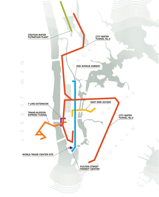
The vast underground network of tunnels in New York City is the focus of an historic exhibition allowing visitors into a world unknown and featuring the much-discussed, but little understood mega-projects bringing the City’s transportation infrastructure into the 21st Century.
An exhibition at Grand Central Station and the New York Public Library highlighting the amazing mega projects that lay beneath the city streets. The website has a great selection of current and historical photos and drawings from the 8 Great Projects Under New York. This is looking like a must see for me.
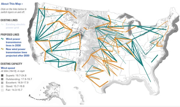
NPR maps the Energy Grid
Posted April 29th, 2009 at 2:29 pm. There are 0 comments.
NPR has some very nice visualizations of the United States electrical grid, including views for solar power and wind sources, including the the below which shows the realationship between where the good wind is, darker colors, and where the power grid is, not usually all that nearby.
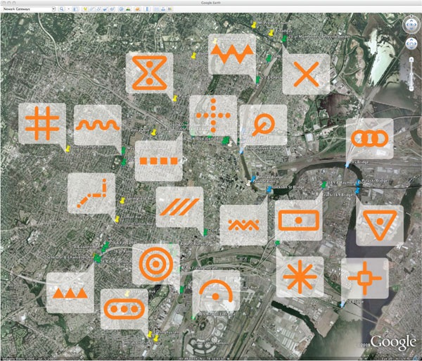
gateways to newark by pentagram architects
Posted April 17th, 2009 at 10:52 am. There are 0 comments.
Newark Gateways by Pentagram Architects to create a series of gateways to the city of Newark New Jersey. Painting a series of cartographic type symbols into the Newark streetsccape, in actual physical space, with the intention that they will eventually be incorporated into google earth & google maps satellite views. There are two very interesting ideas at play here – deliberate alteration of the physical environment to affect the display of its digital representation, and the cartographication of the physical space, placing the visual language of representation into the actual.
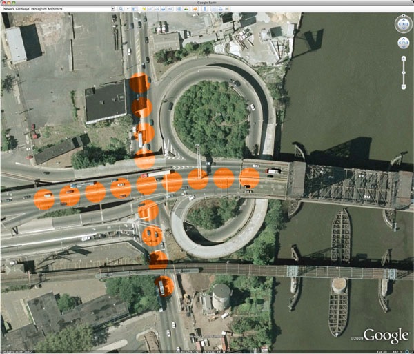
Map symbology has a long and storied history. The process of representing the three-dimensional world as flat and map-like requires a notational language. Our proposal places a new set of distinct symbols “on the map” by creating them for the Google Earth point of view. With paint and little else, Newark can define itself, celebrate its entry points, and address a global audience, all in one stroke. The painted “events” are visible and engaging on Google Earth, while the real locations would be signed with images from above that explain the colors and patterns on the ground.
tokyo jogging
Posted April 15th, 2009 at 12:18 pm. There are 0 comments.
Try to run on the google street view like a jogging game of wii fit from katsuma on Vimeo.
tokyo jogging is a mashup of wiimote and google streetview. Lets you “run” in Tokyo, in your web browser.
The possibilities of this are pretty interesting. Combined with the tv screen on the treadmill or exercise bike at the gym you could run world famous marathon routes and in places where running isn’t usually feasible, say, run the length of the New York Thruway.
via @oliver76
inspiration : data as a seductive material
Posted April 5th, 2009 at 1:17 am. There are 0 comments.Serendipity is looking in a haystack for a needle and finding the farmers daughter
– Julius Comroe Jr.
superbowl twitter timeline on nyt.com
Posted February 3rd, 2009 at 11:34 am. There are 0 comments.
Wonderful map + timeline showing most popular ‘tweets’ during the superbowl. You can look at all ‘tweets’ or seperate categories such as ads (Cash4Gold and GoDaddy being ones I personally contributed too, in as much as I thought they were aweful) or the ever useful emoticon map.

Born at 30,000 feet
Posted January 20th, 2009 at 7:08 pm. There are 0 comments.BLDGBLOG points to the interesting status bestowed upon a newly born baby girl. While flying from Amsterdam to Boston, a Ugandan women went into labor and gave birth to a child, which was subsequently deemed to be Canadian by US Customs officials. It was determined that the birth occurred over eastern Canada.
Extrapolating from this situation, BLDGBLOG speculates further:
Of course, one wonders what citizenship this baby would have been given if they had been flying over the middle of the ocean, for instance, or across the tangled borders of an enclave or exclave. A complicated mathematics of trajectory, speed, and height is unleashed by terrestrial scholars below in order to find the exact location of the plane at the moment of childbirth.
Like something out of Borges, imperial trigonometricians are called in for consultation. Their calculations take days and arguments break out.
Perhaps the child goes on to be famous – a political leader, a poet, a revolutionary, the next pope – and his or her exact aerial origin becomes increasingly important to find out. Weather data and wind speed, the weight of fellow passengers, tiny aerodynamic imperfections in the wings, and even gravitational anomalies in the earth’s crust are brought to bear: how fast was the airplane traveling?
Shifting Boundries
Posted January 19th, 2009 at 3:54 pm. There are 0 comments.
Since seeing this first post on the Shape of Alpha on the code.flickr blog many many weeks ago I have thought about what it means nearly everyday. Future geographical boundries are becoming more flexible as we define them with our metadata. We are where we think we are, even if that particular there isn’t exactly right. These zones are the questionable locales located between conventional boundries as defined by geographical coordinates recorded in maps and property deeds and the line we have drawn for ourselves, collectively, where once place ends and another begins.
[ iamtheweather powered by Wordpress And is definitely Not Plastic Bag ]